
NASA App
Re-Engaging Users in Missions with an Events Dashboard
Role: UX Designer & Research Lead for a team of 4 Designers
Tools: Figma, Adobe Photoshop, Optimal Sort, Google Slides
Collaborators: UX Design Mentors and 3 other UX Designers in a Hackathon challenge
The Story: We were challenged to add a feature onto an app - after seeing the NASA app, we decided we would also need to do a basic redesign. We decided to add a "add to calendar" feature to better engage users with NASA mission events and Astronomical events. We ended up creating a first iteration to build off of for a complete redesign.
We were challenged to add a feature to the NASA App
We were tasked to adding a feature to any app that we thought could use an update. After scowling through the apps we were familiar with, we saw the NASA App...
It needed more than just a new feature
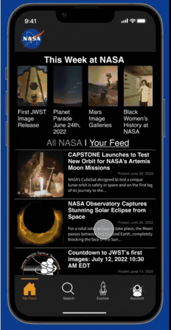
[Below] Current screenshots of the NASA App.


We decided to also redesign the look and feel of the app to make it easier to use
This app clearly has room for improvement. Inconsistent navigation, images being used as buttons, inconsistent colors, and a general unintuitive layout screams for the help of a UX Designer.
But the assignment was to add a feature to this app... in order to do so we would first need to understand what features NASA does have and what users expect to find that they're not getting. Additionally it seemed like there was a huge opportunity here to re-engage users with NASA as there are exciting things happening, but with no way to keep updated most people find out about rocket launches and astronomical events the day before, or worse, the day after.
We identified possible new features through discussion and defined our goals
Goal 1: Add one of the features below to the NASA App to increase user engagement.
-
Add customizable notifications for events
-
Create an "Add to Calendar" button for NASA & Astronomical events.
-
Add a "find a local planetarium or space museum" tab
Goal 2: Redesign the Navigation and overall look of the app so that it is more empathetic to users and decreases user confusion.
Goal 3: Align the app colors, fonts, and buttons to the existing NASA Web Design System.
Goal 4: Try out split facilitation in our group of 4. (I would lead Research, while the three other designers each would lead Define, Design, and Deliver stages of the design process.)
I lead the Research phase - I planned Interviews, a Card Sort, a comparative analysis, and learned about NASA's Web Design System
As Research Lead, I decided to attack the app from all angles. Since the app is clearly not empathetic to users, we need to get into our users heads and understand exactly how they think about NASA.
-
How might we increase user engagement with NASA so that they can enjoy space content more often?
To these ends I planned:
1. Interviews with Users with Generative Usability Testing
-
What do they think of NASA and why?
-
What do they expect the App to do?
-
What works within the app? What doesn't?
-
What do they think of the 3 possible features that we're considering?
2. Card Sorting with a Survey
-
Where do they expect to find things within the app menus?
-
How should we redesign the navigation so that users understand it better?
-
What are users familiar with already?
3. Comparative Analysis
-
Since NASA has no direct competitors, what are other popular apps utilizing to increase engagement?
-
What familiar UI patterns might we use to achieve our goals?
-
What do our 3 possible features look like on other apps?
4. Catalogue & Study the Existing NASA Web Design System
-
How should we adapt it to the app?
-
What colors, buttons, menus, etc. are users already familiar with?
-
How might we change the Web Design System to a mobile night viewing "Dark Mode"?
Users were confused by the app's layout and wanted to be more connected to NASA events
1. Users universally loved NASA and the fact that NASA stands for the pursuit of knowledge, they did however find NASA's public engagement lacking and worried about what might happen to their funding in the future. (They were also VERY confused by the app.)
2. Users tended to organize topics chronologically - separating current missions from NASA history and events into history, recent, live, next week, and years into the future.
3. Other platforms allow users to enable/disable notifications for specific topics. (Backed up by most users are only interested in certain NASA topics.)
4. Most platforms with a variety of content bundle notifications into 1 notification at various time intervals.
5. Many apps with events allow users to add events to their calendar.
Two Personas emerged from Interview
After interviewing and surveying so many people, we started to understand what our users might be like. We noticed one major difference was some users were primarily interested in the rockets and missions, while others were interested in astronomical events and images. Thus we created our Primary and Secondary personas.
Launch Watchers

Stargazers

To engage both Luna and Greg, we decided to add an events feature
After looking through all of our insights we decided the best feature for Luna and Greg was the "Add Event to Calendar" button.
Greg and Luna need a better way to keep up to date with specific upcoming events such as rocket launches and meteor showers so that they may feel connected to humanity and the universe.
The NASA App will allow users to keep up with space events and add them to their calendar so they won't feel like they're missing out on their favorite events and have a more engaging, efficient, enjoyable way of connecting with NASA.
To redesign the app and add in the new feature, we sketched as a team
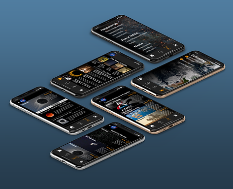
We conducted a Design Studio using the Crazy 8's method from Nielson Norman, creating 100+ variations of designs. We took the best from each round and finally agreed on a single design.
We decided to continue the spirit of the design studio, each creating our own versions of different screens for grayscale wireframes, then our own version of color and font possibilities using the Web Design System. We then aligned them, taking the best from each round.
I lead the Event screen (right) in the Grayscale Wireframes Phase
The screen I was responsible fro was the Event screen. ("Total Solar Eclipse April 8, 2024").


We conducted Usability tests to validate our design's navigation, layout, and icons.
We decided to do a quick round of usability testing to test our navigation, layout, and icons.
-
Can our users find out when the next total solar eclipse will occur?
-
Do users prefer the icons, ellipses with modal, or no icons at all on homepage article cards?
-
How do they feel about the arrangement of the app in general?
We had a few Challenges Arise when testing navigation, naming conventions, and icons. We also had personal issues on our team that made the project more challenging
We quickly found out we had quite a few issues with our wireframes:
1. Users couldn't find the global navigation. (Additionally the hamburger menu is mobile web convention, not app convention.)
-
Solution: Redesign and Swap to a bottom bar navigation.
2. When they did find the global navigation, the term "Stargazing" did not mean 'Eclipses' to them.
-
Solution: Change "Stargazing" to "Exploring the Sky"
3. Users disliked the icons and wanted a better way to differentiate events from articles.
-
Solution: remove the icons from homepage article cards and change add event to calendar icon to an underlined tertiary button.
Additionally, we were having problems within our team - for my teammates there were personal issues at home that made balancing work and outside life a challenge.
My personal strategy for dealing with this slough of problems was to step up and facilitate continued progress. I started by making a list of things that needed to be accomplished each day. When that day's assigned leader was unavailable I checked in with each teammate, voicing to the group when we had forgotten items, and supported my team to take time off when they needed it. In the end I got through it by being organized, flexible, and stepping up to lead when necessary.
We solved these issues by adding in bottom bar navigation and changing buttons
Note the change from hamburger menu to bottom bar navigation. Additionally we decided to get rid of most of the share icons and make the "add to calendar" button a tertiary button.


More Usability Testing showed improvement and new challenges presented themsel
After the major redesign and color lift, we were ready for another round of usability testing. We tested 8 users with 5 tasks along with 7 goals.
The results again, left us with a lot to improve upon:
1. Users will be able to locate the global navigation.
-
87% of those tested Succeeded - one users struggled because it was black on black and they were viewing it in daylight.
-
Solution: Lift color of navigation so that it contrasts slightly with the dark mode text. (Though future iterations would have a daytime/light mode to further address this problem).
2. Users will be able to easily understand what the icons in the
global navigation mean.
-
62% of those tested Succeeded - users were slightly confused by the icons and some thought the text size was too small under each icon.
-
Solution: increase text size and swap for more familiar icons.
3. Users will understand that the Eclipse is the next solar eclipse.
-
62% of those tested Succeeded - Users assumed it would be the next solar eclipse, but others wondered if it really was.
-
Solution: Create an events tab that lists all events in chronological order.
4. Users will be able to find out when NASA will next go to the
moon.
-
12% of those tested Succeeded - Users did not know what each mission was about on the tertiary missions nav page - they had never heard of Artemis before.
-
Solution: Add a brief bio explaining what the purpose/goals of each mission are.
5. Users will be able to easily follow Artemis mission and
complete the login flow that follows.
-
75% of those tested Succeeded - Some users did not immediately see the follow button/star icon. They expected it to be on the top right.
-
Solution: Increase text size under each icon and move follow button to top right.
6. Users will be able to easily unfollow James Webb Space Telescope.
-
100% of those tested Succeeded
7. Users will be able to locate an article they had previously bookmarked.
-
100% of those tested Succeeded
Reflections: we took on too much, but were able to design an objectively better design than the original app
Return on Investment & Metrics
This app was a HUGE undertaking for a 2 week sprint. With that in mind, it probably needs at least a few more rounds of usability testing and iteration before it's ready for launch.
1. Continue iterating with user feedback, more comparative analysis, and input from stakeholders.
2. Rethink information architecture and change "Explore" icon to something more on brand with NASA.
3. Make events stand out from articles and add a calendar view.
4. Create an onboarding flow.
5. Create a white "daytime" mode for those who aren't stargazing and find dark mode inaccessible.
6. Explore adding some features to top to raise call to action for highlighted features (eg. AR, Livestreams, NASA TV, etc.)
7. Create Minimum Viable Product recommendations to present to stakeholders
While this redesign has not been seen by stakeholders nor been launched, when presented with the original users from generative usability tests 100% of users preferred our design to the original app.
"I wish this is what the app actually looked like, maybe I would actually keep it on my phone!" - Engineer, 33 years old
We increased usability immeasurably with most tasks going from 0% success rate to over 80% success.
Takeaways & Learnings
This project taught me so much, it's hard to say where to start.
1. How to get through problems with a team - what does split leadership look like when teammates need to be absent?
2. Mobile web and Mobile Apps have very different UI patterns, we should've caught the hamburger menu/bottom bar navigation difference in comparative analysis, but notes were not taken well enough. In the future, all members of the team should be reviewing comparative analysis to avoid wasting time.
3. You can redesign an entire app in 2 weeks.... but not well. There are so many changes I would make to our final design, but at the end of the day, it still came out way better than the original design. If anything this taught me the value of what UX designers can bring to the table.