

The Period Collective
Increasing Donations by Educating Users & Storytelling Flows


Role: Contract UX Designer; Solo
Tools: Figma, Adobe Illustrator, Maze, Google Suite, Canva
Collaborators: Worked closely with the Developer, President, and Copywriter.
The Story: The Period Collective is a local Chicago nonprofit with a fantastic cause - providing period products to people in need. However, they were only getting 2-5 donations per month and their site was full of basic accessibility issues. Additionally they were ready for gender inclusive language, a completely new logo, brand colors, and design system. Out with everything!
I concluded from research that their website needed to be a fantastic storyteller - get the user involved in their cause and what they're doing and inspire them to donate. This project is 90% complete and is undergoing a final round of usability testing and stakeholder feedback. Check back to see the final designs.
The Client's Challenge
The Period Collective asked me to join their project on a recommendation from their developer who had worked with me before on the Sequin project. They needed help redesigning the website of their favorite nonprofit. (See original website below).
The problem?
Users were having a hard time navigating the website due to poor accessibility, outdated information, and confusing user flows.
Additionally The Period Collective was ready for a rebrand. Their original logo (see below) was teal and yellow and featured a silhouette of a woman dancing. Moving forward they wanted to be more gender inclusive and have colors that actually related to what they actually provided: period products to Chicagoans in need.
Logo not gender inclusive

Colors don't feel like period products, nor Chicago.
Text inaccessible and too long
Donate Call to Action too low
Not immediately clear that they serve only the Chicago area
Unclear what they do at first glance. (Dignity? how so?)

Not clear to user what page they're on
Text is long and wide - difficult for users to read.
Colors inaccessible (contrast 2.3:1) and completely
illegible in some areas.
Colors used inconsistently
Project
Business
Goals
1. Optimize the Donate flow. Aim to increase donations from 2-5 per month to 10 or more.
2. Change the colors so that they are WCAG accessible.
3. Come up with completely new branding, logo, and color system to feel more like period products, inclusivity, and Chicago.
4. Change the copy of the website to be gender inclusive and more respectful. (Eg. menstruators and houseless).
Where to Start?
I decided that this project should start with identifying the user, understanding UX nonprofit best practices, and getting outside insight as to how other nonprofits in this space are solving these problems.
1. Interviews with Existing Volunteers and potential Donors in a target demographic (Chicago residents, feminist, with money and/or time to spare)
-
Who are our users?
-
What do they want to know?
-
What are they concerned about?
2. Research UX Design Best Practices for Nonprofits in various UX journals, websites, and podcasts.
-
What have other UX Designers figured out?
-
What works well?
-
What should I focus my time on?
3. Investigate Competitor Design Trends. (Other Period Product nonprofits, famous nonprofits such as WWF)
-
How do they convince the user to donate?
-
What UI Trends are they using? (information hierarchies, colors, buttons, icons, etc.)
-
What colors are they using to represent period products? (eg. Red is so divisive - are they using it?)
Interviews & Issues
It proved incredibly difficult to find someone who volunteered themselves as a "potential donor" to this cause. To make matters worse, I am not a resident of Chicago - so my access to Chicagoans is limited. Additionally time was limited - how should I solve this barrier between me and the users?
1. Interview the other volunteers on this project and focus on how they got started with The Period Collective.
-
How did they first hear about TPC?
-
Why were they interested?
-
What do they tell their friends about TPC?
2. Interview feminists in my area.
-
What do they think about this problem?
-
Have they donated to an organization like this before and why?
-
What would they want to know about TPC before getting involved?
3. Research UX Design Best Practices for Nonprofits
-
What do users typically need to donate?
-
What are users concerned about when it comes to donations?
-
What are users concerned about when it comes to volunteering?
After collecting all of my notes and completing an affinity map, I was able to create my 2 personas: Donna the Donor and Viv the Volunteer. (See below)


Personas
Top 5 Key Research Insights:
1. Nonprofit websites should tell a story in the same way that you would convince someone to donate in a conversation. (eg. About us, How we do it, who helps us, getting involved, what we've been doing lately, and please donate).
2. Users need to understand who the nonprofit is, what the money will be used for, and if it's a tax deductible donation before they're willing to donate.
3. Users are more likely to donate if peers do it first. (Eg. happy to hop on a bandwagon).
4. Users are confused about what TPC does. They thought The Period Collective handed out period supplies. They don't directly - instead they supply care centers and food banks with period products and anything else relevant they might need.
5. Nonprofits typically have a Super-primary button hierarchy reserved for "Donate" - it is in a separate color that cannot be found anywhere else on the site and stands out. (Often orange, red, or yellow).
Site Map Iteration & Design Studio
The Period Collective's original site map was large and not organized well from an information architecture standpoint. Taking inspiration from research and competitive analysis, the site map should be laid out like a story - explaining to the user who they are and eventually landing on donate. (see below.) To get a better look at the sitemap, my comments, and more - check out the figma file here.
Original Sitemap: There are no dropdown options, forcing all of the information to clutter the global navigation, ultimately distracting the user from donating. This also forces too much information to be on one page, such as in "Get Involved" - there were 4 major ways to volunteer plus instructions and forms for each method.


First Iteration Sitemap: Here I significantly reorganized the site map so that there are fewer options in the global navigation. "About" and "Get Involved" include several dropdown options that allow the user to guide themselves through the story of The Period Collective. User friendly titles such as "Who Helps Us?" and "Who Gets Helped?" let the user decide if they care about these questions and get targeted answers. Meanwhile, in the "Get Involved" category, users can see all 4 methods of volunteering just by using the dropdown menu.
I took this updated map to the software developer and president and we collaborated on what was possible and decided to iterate further to remove the gallery and the separate page for "Donate Skills & Knowledge" because both were redundant with another page.

Sitemap with Sketches: After settling on a sitemap my clients agreed with, I decided to get started by doing a design studio and sketching out each page. I tried to keep this level focused on what information should be on each page and in what order that information should be in to keep the story flowing smoothly across each page. I agreed with the stakeholders that I would not be responsible for the the volunteer signup page, so that page I kept as a screenshot for placeholder uses. (Eg. the copy writer and developer will create these pages using the design system I created.)

Grayscale Mid-Fidelity Wireframes
The grayscale wireframes below reflect the insights I gained from research and show the storytelling in more detail.
I used these designs in mid fidelity/grayscale to get targeted feedback on buttons, copy, and overall information architecture layout with users and stakeholders. This avoided unnecessary conversations about color or overall feel at this stage and kept the conversation more focused on layout.
Below are 3 targed screens, to see all of them checkout the Figma file here. (4th page Mid Fidelity Wireframes).
Homepage clearly and concisely states what The Period Collective is.
All text is concise and high contrast
About Page has opportunities for deep dives and for at a glance understandings.
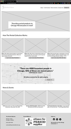

Multiple prompts to donate allow the user to start after they've learned enough. (Without it getting annoying).
Bottom bar clearly mentions Chicago
Donate page is as short as possible and highlights tax deductible status.
Suggested donation amounts clarify what money will be spent on.

Color Exploration
After discussing wireframes with stakeholders, they agreed that we were ready to start exploring color. To get the conversation started, I created a basic example of how their existing colors might look on their new website. (see below)
Original Colors, adding red: Upon seeing their existing colors with red, they decided they didn't like the teal nor the yellow and wanted to start from scratch.

Stakeholders agreed that they didn't like the feel, but did enjoy the examples I showed them of pink and red based sites from other nonprofits. To help them narrow down colors I created 5 different color inspirations that included red and pink to get us started.

The Period Collective stakeholders came back and agreed they loved the flag inspiration - it felt true to their cause and their city. (Eg. Women's Rights Flag, Transgender Pride Flag, and Chicago City Flag).
I decided to move forward with coloring in the homepage to see what that might look like.

Added a darker blue, reminiscent of their original teal to even out the spectrum
Added browns to celebrate the racial diversity of Chicago and as a reminder that most photos on their site will be this color.
Problems with Color
The more I analyzed the colors, I started to see some problems.
1. The White on light pink is not WCAG accessible. (Black on light pink didn't quite feel right either).
2. I was having a hard time adding in the reds to the page both red options felt too harsh and didn't feel right.
They needed an adjustment. (see below)

Made the darker blue a darker tint of the light blue to make them more cohesive.
Removed bright red and opted for darker pink (A darker tint of the light pink).
Reserved the dark red color for the Donate Button only (a super primary button, consistent with UX best practices).
Darker pink is accessible with both white and black text!
Logo Design
The Period Collective was also ready for a new logo. I decided to take a stab at it while they waited for a graphic designer to signup. Their requirements were that it was easy to print (less colors) and was gender inclusive. I decided to use Canva for this project, because I could quickly iterate and land on something that would work for them - then if needed I could recreate a higher quality, similar design in Adobe Indesign.


Designed in Black and White, so that they could easily recolor in multiple colors for merchandise and future advertisements.
Landed on simplicity of a "period" being a circle. (".")
Logo feels gender neutral, fun, clear, and simple =
The winner!
Designing a Design
System
Knowing that clean designs come from consistent design systems that are carefully thought through and stuck to, I decided to start piecing together the design system. See Figma component library here with design system. (page 6 - "Components & Design System")
Updated Color palette with meanings and WCAG checked contrasts for text. (below)
I added a hover/focus blue since most buttons were going to be the dark blue color. Focus states are required for accessibility.
I also added a separate inactive grey color - I'm not sure if this will be necessary, but by adding it now we can set them up for success in the future if they need to have something be inactive in a form.

Fonts and uses (below)
Staatliches: I decided to use a large condensed font for the headings, this font seemed to communicate a seriousness and sense of urgency without being scary or harsh.
Lato: This was the font that they are already using on their existing website. It has a variety of weights and is easy to read due to difference in letter height and sans serif (lack of serifs).

Buttons with states (default, hover, inactive, and focus) (below)
Call to Action: Nonprofit sites need their Donate button to have an extremely high call to action. It should pop right off the page and be one of the first things you notice. For this use, I created a "super-primary" button in a dark red color. Meanwhile standard primary, secondary, and hyperlink buttons are all a consistent dark blue.

High Fidelity Prototype
I met with a mentor on ADPList to get feedback on my UI Design. Bouncing ideas off of another designer is so helpful and is why I generally prefer to work on a team where I get the opportunity to collaborate. Getting her input I realized I had been forgetting some basic principles of design and need to rework my prototype. After getting re-inspired by our conversation, I decided to move forward to usability testing with this design.
Here are 3 representative screens, checkout the full prototype to see more.

Text is even more concise using prinicples of design (color, size, relationship, etc.) to communicate story.

consistent 16px borders between strips
Donate button Red used consistently only for Donate CTA

Next Steps
This project is still currently in development.
-
Branding Colors: With users reporting that it feels "like a baby shower" and not like the trans flag nor the Chicago flag, we are currently working on choosing a new color scheme and ensuring accessibility.
-
Copywriter Collaboration: Before doing a final round of usability testing, I will meet with the copywriter to confirm copy.
-
Usability Testing: To confirm that the site is ready to pass off to developers, more usability testing will be needed.
-
Hand-off to Developers: I will continue to meet and collaborate with the developer to hand off the site to be implemented!
Future Iterations
-
News & Events Tab: In the future The Period Collective needs to evaluate their content - we created the News & Events tab from scratch. Perhaps there are additional categories?
-
Track Donations Over Time: This design was intended to increase donations significantly. (From an average of 2-5 donations per month to a much higher number). Only time will tell if these designs have facilitated that. After a number of months, the numbers will need to be re-evaluated to see if they are hitting target metrics.
-
Volunteer Signup Forms: Volunteer onboarding was not part of this project, in the future the volunteer signup form will need to be evaluated for usability and stakeholder needs.
-
Continued Branding & Merchandise Sales: The new logo that I designed for The Period Collective is in black and white to optimize for cheaper merchandise sales in a variety of colors. Stickers, T-shirts, and more could be sold on the website to gain further funds and incentivize fundraising. (ex. "Donate $25 and get a free sticker!")